The Logged-in / out text component is the preferred method used to enable login and logout and to display the name of the current user. 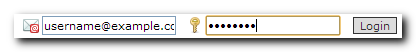
It is used to display links to log out (if logged in), or to log in (if logged out). The 'Logged in / out text' component is added to the application or web site from the Components. 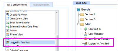
Once added to the tree, the display text must be set by opening the component and entering the desired text, such as shown below. 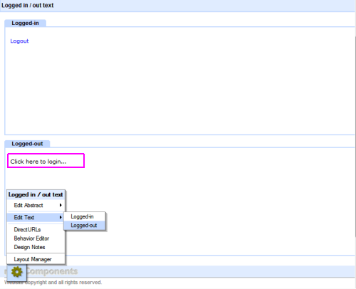
The text surfaces are accessed from the floating Toolbox at the Edit Text link. Log out The 'Logged in' text should include a link to 'Logout' - this is text or an image of your choosing. It must be linked to the special logout component which is only visible to this component in its Link Picker context. 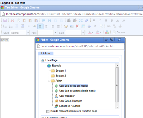
Embedding Once configured the component will appear as an entry in the Embed dialog. You can then embed this where needed. This would typically be on a Layout Element Text Zone, but it could be on virtually any text surface.
Tip:
You can have an unlimited number of ''Logged in / out text' components in an application or web site. They do not just have to be used as a surface for setting log in links - they can also be used to display any content that varies depending on whether the User is logged in or not. | 


